tabs docs

2.11.2

Tabs

Tabs organize multiple panels of related content, allowing users to view one panel at a time.

Install via NPM
npm install @bolt/components-tabs
  {% include "@bolt-components-tabs/tabs.twig" with {
  panels: [
    {
      label: "Tab label 1",
      content: "Tab panel 1.",
    },
    {
      label: "Tab label 2",
      content: "Tab panel 2.",
    },
    {
      label: "Tab label 3",
      content: "Tab panel 3.",
    }
  ]
} only %}

Note: when assigning component props as HTML attributes on a web component, make sure to use kebab-case.

Prop Name Description Type Default Value Option(s)
Panels

All of the tab panels. Each panel should contain a label and content.

array
  • [items]:
    • Type: object
    • Properties:
      • label

        Tab label used in the navigation. Twig only.

        • Type: string
      • content

        Tab panel content.

        • Type: string, object, array
      • selected

        Set active state on tab. Only one active tab allowed at a time. Defaults to first tab.

        • Type: boolean
Align

Horizontal alignment of tab labels.

string start
  • start, center, end
Label_spacing

Set label spacing.

string small
  • small or medium
Panel_spacing

Set panel spacing.

string small
  • none, small, medium
Inset

Controls spacing placement on tab labels and panels.

string auto
  • auto, on, off
Selected_tab - Minimum is 1

Set selected tab by number. To select the second tab, set to 2.

integer 1

tabs

Tab label 1
Tab panel 1
Tab label 2
Tab panel 2
Tab label 3
Tab panel 3

tabs inset

The inset prop controls how label_spacing and panel_spacing are applied. When set to auto (default), there is inset spacing around labels and no inset spacing around panels, which means panels are flush with the edges of the parent container. When set to on, spacing is applied around the labels as well as the panels. This works well in a container which has no inner padding of its own. When set to off, all inset spacing is turned off. label_spacing applies between labels rather than around them, and panel_spacing only applies above the panel, making the panel flush with the edges of the parent container. Inset: auto
Tab label 1
Tab panel 1
Tab label 2
Tab panel 2
Tab label 3
Tab panel 3
Inset: on
Tab label 1
Tab panel 1
Tab label 2
Tab panel 2
Tab label 3
Tab panel 3
Inset: off
Tab label 1
Tab panel 1
Tab label 2
Tab panel 2
Tab label 3
Tab panel 3
Use label_spacing and panel_spacing props, in conjunction with inset, to set spacing around tab labels and panels. See Inset variations page for more on the inset prop.
Label spacing Use label_spacing to set spacing around (or between) tab labels.
Spacing: small
Inset: auto
Tab label 1
Tab panel 1
Tab label 2
Tab panel 2
Tab label 3
Tab panel 3
Inset: on
Tab label 1
Tab panel 1
Tab label 2
Tab panel 2
Tab label 3
Tab panel 3
Inset: off
Tab label 1
Tab panel 1
Tab label 2
Tab panel 2
Tab label 3
Tab panel 3
Spacing: medium
Inset: auto
Tab label 1
Tab panel 1
Tab label 2
Tab panel 2
Tab label 3
Tab panel 3
Inset: on
Tab label 1
Tab panel 1
Tab label 2
Tab panel 2
Tab label 3
Tab panel 3
Inset: off
Tab label 1
Tab panel 1
Tab label 2
Tab panel 2
Tab label 3
Tab panel 3
Panel spacing Use panel_spacing to set spacing around tab panels.
Spacing: none
Inset: auto
Tab label 1
Tab panel 1
Tab label 2
Tab panel 2
Tab label 3
Tab panel 3
Inset: on
Tab label 1
Tab panel 1
Tab label 2
Tab panel 2
Tab label 3
Tab panel 3
Inset: off
Tab label 1
Tab panel 1
Tab label 2
Tab panel 2
Tab label 3
Tab panel 3
Spacing: small
Inset: auto
Tab label 1
Tab panel 1
Tab label 2
Tab panel 2
Tab label 3
Tab panel 3
Inset: on
Tab label 1
Tab panel 1
Tab label 2
Tab panel 2
Tab label 3
Tab panel 3
Inset: off
Tab label 1
Tab panel 1
Tab label 2
Tab panel 2
Tab label 3
Tab panel 3
Spacing: medium
Inset: auto
Tab label 1
Tab panel 1
Tab label 2
Tab panel 2
Tab label 3
Tab panel 3
Inset: on
Tab label 1
Tab panel 1
Tab label 2
Tab panel 2
Tab label 3
Tab panel 3
Inset: off
Tab label 1
Tab panel 1
Tab label 2
Tab panel 2
Tab label 3
Tab panel 3

tabs align

Align: start
Tab label 1
Tab panel 1
Tab label 2
Tab panel 2
Tab label 3
Tab panel 3
Align: center
Tab label 1
Tab panel 1
Tab label 2
Tab panel 2
Tab label 3
Tab panel 3
Align: end
Tab label 1
Tab panel 1
Tab label 2
Tab panel 2
Tab label 3
Tab panel 3

tabs theme

Tab label 1
Tab panel 1. Lorem ipsum dolor sit amet, consectetur adipiscing elit. Praesent porta ut tortor id luctus. Cras fermentum pretium ipsum sit amet tempus. Sed lobortis dui ante, feugiat pharetra turpis dapibus sit amet. Donec hendrerit diam vel ante hendrerit ornare. Donec non aliquam nisi.
Tab label 2
Tab panel 2. Aliquam dignissim non ligula et condimentum. Donec et luctus orci. Interdum et malesuada fames ac ante ipsum primis in faucibus. Vestibulum ante ipsum primis in faucibus orci luctus et ultrices posuere cubilia Curae; Integer quis dui velit. Proin hendrerit turpis eu elementum rhoncus.
Tab label 3
Tab panel 3. Curabitur fermentum dolor sed dignissim lobortis. Curabitur rutrum arcu velit, a placerat nunc sodales at. Sed vel mi ac lectus volutpat accumsan nec in ipsum. In hac habitasse platea dictumst. Morbi lobortis pellentesque ultricies. Cras ultrices sapien quis tellus porttitor consequat.

tabs content

A teaser

Eyebrow

This is a headline.

Body text. Vestibulum ante ipsum primis in faucibus orci luctus et ultrices posuere cubilia Curae; Proin vel ante a orci tempus eleifend ut et magna. Lorem ipsum dolor sit amet, consectetur adipiscing elit.

A table
Column 1 Column 2 Column 3
Row 1 R1C1 R1C2 R1C3
Row 2 R2C1 R2C2 R2C3
Row 3 R3C1 R3C2 R3C3
Footer FC1 FC2 FC3
An image
Mountains Mountains
A video
Tabs
Tab label 1
Tab panel 1
Tab label 2
Tab panel 2
Tab label 3
Tab panel 3
An accordion
This is the accordion content.
A carousel
Slide 1 Slide 2 Slide 3 Slide 4 Slide 5 Previous Next
Tab label 1
Tab panel
Tab label 2
Tab panel
A very long tab label
Tab panel
Tab label 4
Tab panel
Tab label 5
Tab panel
Tab label 6
Tab panel
Tab label 1
Tab panel
Tab label 2
Tab panel
Tab label 3
Tab panel
Tab label 4
Tab panel
Tab label 5
Tab panel
Tab label 6
Tab panel

tabs selected tab

Use selected_tab prop to pre-selected a tab by number. To select the second tab, set selected_tab to 2. Defaults to first.
Tab label 1
Tab panel 1
Tab label 2
Tab panel 2
Tab label 3
Tab panel 3
Tabbed Band A Tabbed Band is a high-level content container that utilizes a specific configuration of the Band and the Tabs components. Tabs will need the following props: inset: "off", label_spacing: "medium", panel_spacing: "medium",

This is a Tabbed Band

This is Tab 1

Maximize Value with Next Best Action Intelligence

Blow away your customer’s expectations - engage each individual one-to-one, letting the AI constantly adapt to their needs.
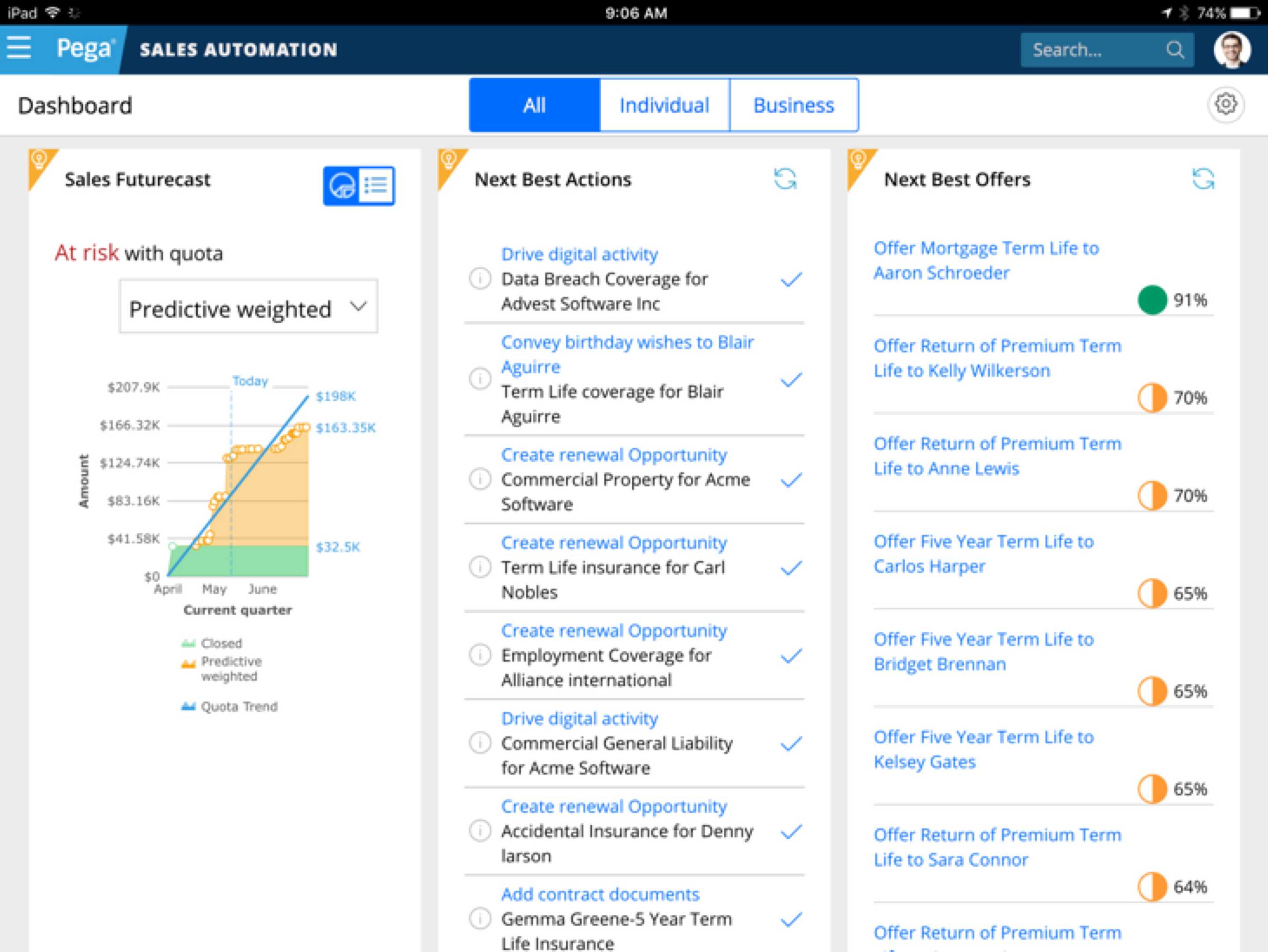
This is Tab 2
Maximize Value with Next Best Action Intelligence

Blow away your customer’s expectations - engage each individual one-to-one, letting the AI constantly adapt to their needs.

This is Tab 3

Customer Decision Hub

Infuse real-time AI into every customer engagement

There’s nothing artificial about Pega’s proven AI. This always-on brain gets results. Using pragmatic artificial intelligence and decision management, you can improve response rates by up to 6X, NPS by 30 points, and get ROI as high as 500%.

Call to Action

tabs web component

Web Component Usage Tabs is a web component. Add the <bolt-tabs> element containing multiple <bolt-tabs-panel> elements to create a set of tabs. Inside each <bolt-tab-panel> mark the "label" content with the attribute slot="label". Everything else is considered tab "content".
Tab label 1 Tab panel 1 Tab label 2 Tab panel 2 Tab label 3 Tab panel 3
<bolt-tabs> <bolt-tab-panel> <bolt-text slot="label">Tab label 1</bolt-text> <bolt-text>Tab panel 1</bolt-text> </bolt-tab-panel> <bolt-tab-panel> <bolt-text slot="label">Tab label 2</bolt-text> <bolt-text>Tab panel 2</bolt-text> </bolt-tab-panel> <bolt-tab-panel> <bolt-text slot="label">Tab label 3</bolt-text> <bolt-text>Tab panel 3</bolt-text> </bolt-tab-panel> </bolt-tabs>
Prop Usage Configure the tabs with the properties specified in the schema.
Tab label 1 Tab panel 1 Tab label 2 Tab panel 2 Tab label 3 Tab panel 3
<bolt-tabs panel-spacing="small" align="center"> <bolt-tab-panel> <bolt-text slot="label">Tab label 1</bolt-text> <bolt-text>Tab panel 1</bolt-text> </bolt-tab-panel> <bolt-tab-panel> <bolt-text slot="label">Tab label 2</bolt-text> <bolt-text>Tab panel 2</bolt-text> </bolt-tab-panel> <bolt-tab-panel> <bolt-text slot="label">Tab label 3</bolt-text> <bolt-text>Tab panel 3</bolt-text> </bolt-tab-panel> </bolt-tabs>
Advanced Usage Two advanced options are shown below. Automatically show a <bolt-tab-panel> by setting selected-tab on <bolt-tabs> or by adding selected to a single <bolt-tab-panel>.
Tab label 1 Tab panel 1 Tab label 2 Tab panel 2 Tab label 3 Tab panel 3 Tab label 1 Tab panel 1 Tab label 2 Tab panel 2 Tab label 3 Tab panel 3
<!-- Use `selected-tab` to set selected tab --> <bolt-tabs selected-tab="2"> <bolt-tab-panel> <bolt-text slot="label">Tab label 1</bolt-text> <bolt-text>Tab panel 1</bolt-text> </bolt-tab-panel> <bolt-tab-panel> <bolt-text slot="label">Tab label 2</bolt-text> <bolt-text>Tab panel 2</bolt-text> </bolt-tab-panel> <bolt-tab-panel> <bolt-text slot="label">Tab label 3</bolt-text> <bolt-text>Tab panel 3</bolt-text> </bolt-tab-panel> </bolt-tabs> <!-- Use `selected` to set selected tab --> <bolt-tabs> <bolt-tab-panel> <bolt-text slot="label">Tab label 1</bolt-text> <bolt-text>Tab panel 1</bolt-text> </bolt-tab-panel> <bolt-tab-panel selected> <bolt-text slot="label">Tab label 2</bolt-text> <bolt-text>Tab panel 2</bolt-text> </bolt-tab-panel> <bolt-tab-panel> <bolt-text slot="label">Tab label 3</bolt-text> <bolt-text>Tab panel 3</bolt-text> </bolt-tab-panel> </bolt-tabs>